Iqra Idrishi UI/UX Designer

Iqra Idrishi

Hi, I'm Iqra, a UI/UX Designer who loves turning ideas into simple, intuitive, and visually engaging digital experiences. I'm passionate about understanding how people interact with products and creating designs that feel effortless to use.

UI/UX Design  •  Interaction Design  •  Visual Design

Third year, BSc CSIT
St. Xavier's College, Kathmandu

Featured Work

A selection of interfaces and experiences I’ve designed from solving everyday problems to exploring ideas through visual design.

Nepdine

Restaurant management system

View in Figma, Nepdine, opens in a new tab

Nepdine is a restaurant management system designed to simplify everyday restaurant operations through a clear and intuitive interface. The system brings key tasks such as table reservations, order management, menu management, staff coordination, and customer interactions into one streamlined platform.

As the UI/UX designer, I focused on creating a clean, efficient, and easy-to-navigate experience, with clear information hierarchy and consistent interactions that help restaurant staff manage tasks quickly and effectively.
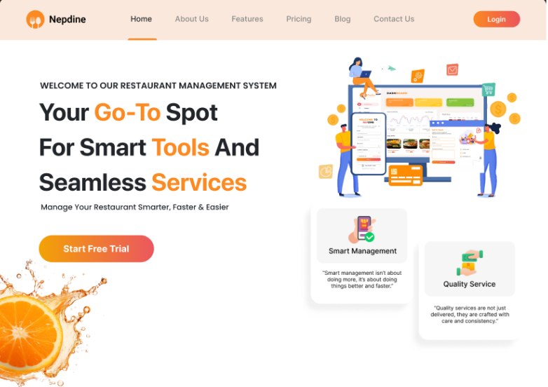
Nepdine landing page: a peach header with Home, About Us, Features, Pricing,
Blog and Contact Us navigation and a Login button, the headline 'Your Go-To
Spot For Smart Tools And Seamless Services' with Go-To, Tools and Services
set in orange, a Start Free Trial button over a splashing orange slice, and an
illustration of two people working at a dashboard beside Smart Management and
Quality Service cards.
Role
UI/UX Designer — designer on the project
Dates
07/2025 – 12/2025 · 6 months
Platform
Responsive web · owner-facing site and staff-facing product
Scope
Table reservations, order processing, menu management, staff coordination, customer experience
Tools
Figma, Illustrator

The problem

Restaurants often still rely on paper, memory, and disconnected processes to keep things running. Reservations sit in a book, orders move through handwritten tickets, and managers have little visibility into what happened until much later.

Nepdine brings these pieces into one system. The challenge was not simply to digitise each task, but to connect them into one flow — from reservation, to table, to order, to bill — without making the work slower for the people using it.

How I worked

I started with the service, not the screens. I mapped the restaurant workflow first and identified the core chain: reservation → table → order → bill. This became the foundation for the product structure.

I designed for two very different audiences. The landing page speaks to restaurant owners who are deciding whether to use Nepdine. The product speaks to staff who need to move quickly during a busy shift. They share the same identity, but they need very different experiences.

I designed the product before the marketing. I wireframed the staff experience first and built the landing page around what the product could actually deliver.

I tested the most important moments. In Figma, I prototyped the reservation-to-seating flow to explore whether a host could handle a walk-in and assign a table without losing their place in the floor plan.

Why it looks like this

I wanted Nepdine to feel more like a restaurant product than a piece of accounting software.

The owner-facing experience uses warmer colours and food imagery to create a sense of familiarity and trust. Inside the product, I stripped most of that away. Staff shouldn't have to navigate decoration when they're trying to take an order or find a table during a busy service.

The visual language changes with the context, while the overall identity stays consistent.

What I would change

The landing page still leans quite heavily on visual decoration. If I continued working on Nepdine, I'd test whether the first screen should focus more on showing evidence of the product its dashboard, workflow, or measurable benefits — rather than creating appetite through imagery.

The question I'd want to answer is simple: what makes a restaurant owner trust Nepdine enough to hand it their floor?
Movie Reservation

Mobile app · UI and prototype

Open the prototype, Movie Reservation, opens in a new tab

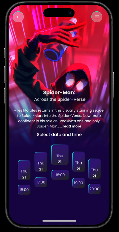
A mobile cinema booking experience designed to make the journey from finding a movie to holding a ticket feel simple and effortless. The app brings browsing, showtime selection, seat booking, and digital tickets into one streamlined flow, with particular attention to making the seat-selection experience clear and easy to navigate on a small screen.

The goal was to create an interface that feels immersive enough for discovering movies, but focused enough to make booking quick and intuitive.

Role
Complete UI and interactive prototype
Dates
05/2025 – 06/2025 · 2 months
Platform
Mobile · iOS frame
Screens
Browse, film detail and showtimes, seat selection, mobile ticket
Tools
Figma
Film detail screen: a Spider-Man poster fills the top, a synopsis
below, and a staggered row of date and showtime chips.
Detail
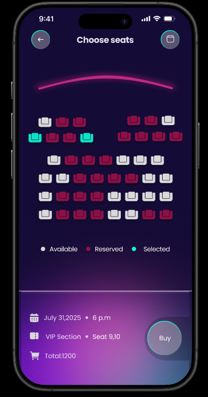
Seat selection screen: a curved screen line above a grid of seats in
available, reserved and selected states, with a legend and a summary
bar showing date, VIP section, seats 9 and 10 and a total of 1200.
Seats
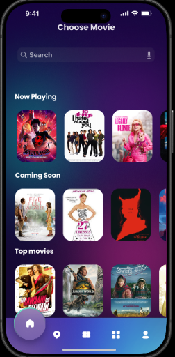
Browse screen: a search field with Now Playing, Coming Soon and Top
Movies rows of film posters.
Browse
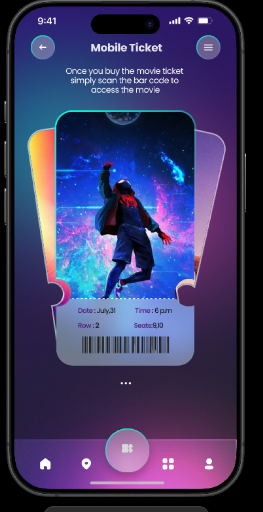
Mobile ticket screen: a perforated ticket shape holding cover art,
date, time, row and seat, above a barcode.
Ticket

The hard screen

Most of the app is straightforward. Seat selection is where the experience gets complicated.

A cinema layout is a dense spatial map with multiple seat states that need to be understood at a glance, while still being easy to navigate on a small screen. At the same time, the movie artwork and visual elements are competing for attention.

The challenge was to make the seat map feel clear, immediate, and trustworthy so users can confidently choose a seat without second-guessing their selection.

Design decisions

A dark visual foundation. I kept the interface dark throughout, allowing the movie artwork to bring in colour while keeping the seat map focused and easy to scan.

Clear seat states. Available, selected, and unavailable seats are visually distinct through colour and fill, with enough contrast that the difference isn't dependent on colour alone.

An intuitive cinema layout. The curved screen indicator gives users an immediate sense of orientation, making it clear which direction they'll be facing before they start choosing seats.

A persistent booking summary. The bottom summary keeps the important details — date, section, seats, and total visible alongside the purchase action, so users always know what they're committing to.

A ticket designed for the real world. The final ticket screen strips everything back to what matters at the entrance: barcode, movie, time, and seat. Nothing competes with the information the user needs to show at the door.

What I would change

The showtime chips are staggered for visual rhythm, which costs scanability. A plain row grouped by time of day would be easier to read and less interesting to look at, and I now think easier wins here.

WishKart

Greeting-card platform · web

View in Figma, WishKart, opens in a new tab

A greeting card is rarely the reason someone opens a website. They arrive with a person, an occasion, and a feeling in mind. WishKart was designed around that moment , making it easy to find the right card, personalize it, and send something meaningful without getting lost in endless templates.

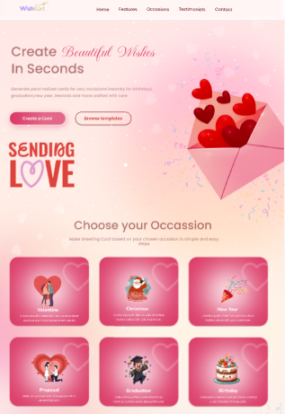
WishKart home page: the headline 'Create Beautiful Wishes In Seconds'
over a pink illustrated envelope of hearts, and a grid of occasions
including Valentine, Christmas, New Year, Proposal, Graduation and
Birthday.
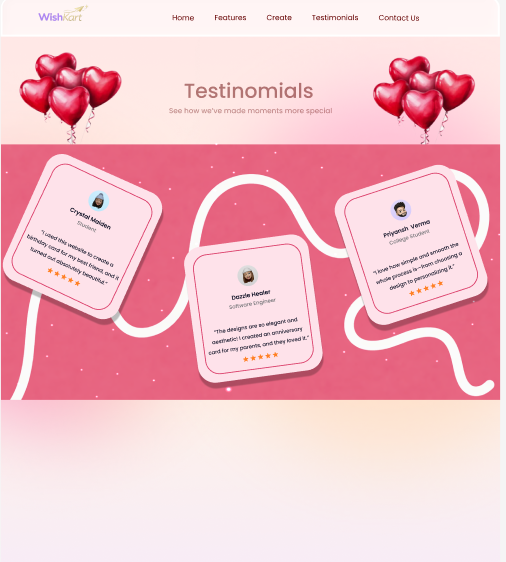
Testimonials section: three tilted cards strung along a ribbon, each
with a name, role, quote and star rating. The quotes are placeholder
content designed for the mockup.
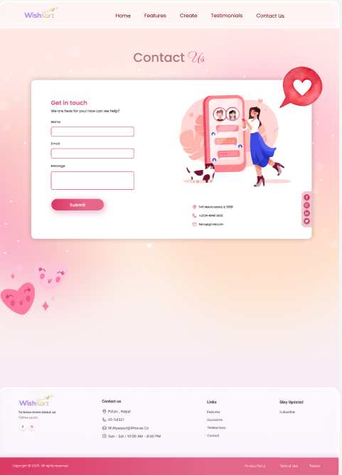
Contact page: a Get in touch form with name, email and message
fields beside an illustration of a woman with a phone, above a
footer with contact details and links.
Role
UI/UX Designer
Platform
Responsive web
Screens
Home and occasion picker, template browse, testimonials, contact
Tools
Figma, Illustrator, Canva
Note
Testimonials in the mockup are designed placeholder content, not real quotes

The job

Choosing a greeting card is an emotional task, but it is also a quick one. Someone might be making a card for a birthday, graduation, or proposal, already knowing who it is for and why they are making it. They should be able to find a direction, make it personal, and be done in a couple of minutes. The interface should support the feeling, not get in its way.

Decisions

  • Occasion first navigation. Instead of asking people to browse through templates, WishKart starts with what they already know: the occasion. From there, the choices become more specific and easier to make.
  • Illustration over photography. Photographs can feel specific to someone else's story. Illustrations leave room for the person making the card to imagine their own.
  • A three step flow. Occasion → template → personalise. The path stays short and focused, with no account or unnecessary setup before users can start creating.
  • A quiet editor. The warm gradient belongs to the marketing experience. Once someone starts creating, the interface becomes deliberately quieter so the card itself becomes the focus.

What I would change

The occasion grid currently gives every category the same visual weight. That makes the interface feel balanced, but not necessarily useful. If birthdays account for the majority of visits, they should have a stronger presence in the hierarchy. I would rethink the grid to reflect actual usage rather than treating every occasion as equally important.

A playful pizza ordering website designed around making the food the focus. I explored bold visuals, clear hierarchy, and a simple browsing experience to make choosing a pizza feel quick, intuitive, and a little more fun.

Food websites become visually crowded easily. The goal was to make the pizzas feel tempting while keeping the information that decides an order name, price, ingredients and the action itself easy to find.

Role
UI/UX Designer
Platform
Responsive web · ordering and menu browsing
Focus
Web design · visual design · prototyping · interaction
Tools
Figma
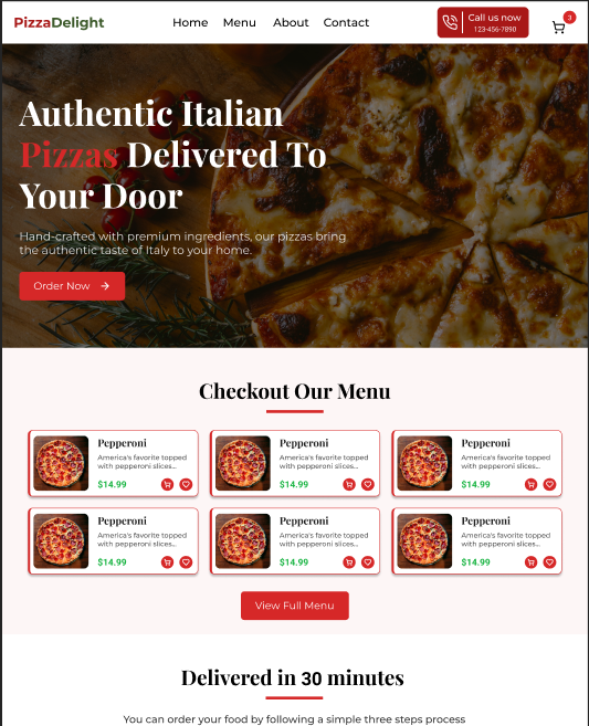
PizzaDelight home page: a dark hero photograph of a pepperoni pizza carrying
the headline 'Authentic Italian Pizzas Delivered To Your Door' and an Order
Now button, a Checkout Our Menu grid of six pepperoni cards with prices and
add buttons, and the start of a 'Delivered in 30 minutes' section below.

The idea

A web experience for browsing and ordering pizza, designed to balance strong food imagery with straightforward navigation.

What I focused on

  • Visual hierarchy
  • Product presentation
  • Simple navigation
  • Clear calls to action
  • Interactive prototyping

The result

A bold, food-focused website concept that combines visual personality with a straightforward ordering experience.

DualSense

Product card · visual study

View in Figma, DualSense, opens in a new tab

A product card designed in Figma around the PlayStation DualSense controller. The focus was on creating a strong product presence while keeping the layout clean, balanced, and easy to scan.

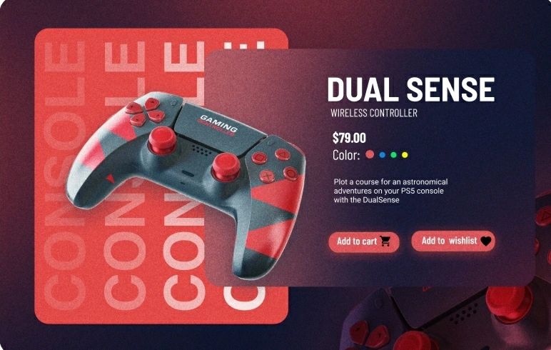
Product card concept: a red and grey DualSense controller overlapping a
crimson panel with the ghosted word CONSOLE repeating behind it, beside a
dark glass panel holding the title, 79 dollar price, colour swatches and
Add to cart and Add to wishlist buttons.
Role
Concept and visual design — self-directed
Platform
Web · single product card composition
Focus
Visual hierarchy, depth without shadow, colour restraint
Tools
Photoshop, Figma
Note
Study piece. DualSense is a Sony product; this is not commissioned or affiliated work

Illustration & Visual Experiments

Selected illustrations crafted in Adobe Illustrator.

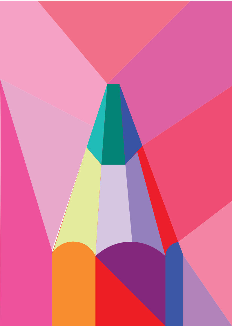
  • Vector illustration of a sharpened pencil tip drawn as flat overlapping
planes of pink, magenta, red, violet, teal and pale yellow.

    Pencil · geometric planes

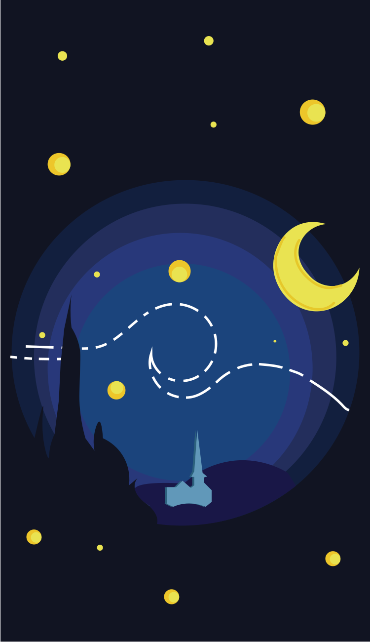
  • Flat vector night scene: a yellow crescent moon and scattered stars over a
dark blue town with a church spire and cypress silhouettes, with dashed
white lines swirling through the sky.

    Starry night · flat vector study

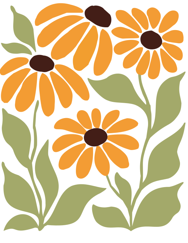
  • Vector illustration of three sunflowers with orange petals and dark brown
centres on sage-green leaves and stems.

    Sunflowers · shape and negative space

  • Vector landscape of layered mountain ridges in orange, red and deep maroon
beneath a yellow-to-red gradient sunset sky.

    Sunset ridges · layered gradient

How I work

Think first, design second. I like to understand the problem before opening Figma. My process moves from figuring out what needs to work, to shaping how it should feel, and finally refining the details that make an interface feel complete.

  1. Understand the problem

    I start by understanding the user, the context, and what the product actually needs to solve. I look for the simplest way to frame the problem before thinking about screens.

    Research · User flows
  2. Define the structure

    I map out the flow and information hierarchy before getting attached to visual details. This helps me understand what belongs on a screen and what doesn't.

    User flows · Information architecture
  3. Explore

    I sketch, wireframe, and experiment with different directions. I prefer exploring early, when changing an idea is still easy.

    Sketches · Wireframes · Concepts
  4. Design & prototype

    Once the structure feels right, I build the visual system and turn the screens into a working prototype. I pay attention to hierarchy, spacing, typography, and interaction.

    UI design · Design systems · Prototyping
  5. Refine

    The final stage is where I become picky. I check responsive layouts, interaction states, consistency, and all the small details that are easy to overlook but change how a product feels.

    Responsive design · Interaction · Edge cases

  • Figma Design, components, prototypes
  • Illustrator Vector marks and icons
  • Photoshop Image work and composites
  • Framer Interactive prototypes
  • Canva Fast collateral and social
  • CapCut Video and motion cuts

About

I’m a computer science undergraduate who found my way into design. I like working where technology and creativity meet , understanding what can actually be built while thinking carefully about how it should feel to use.

I came to interface design through drawing. I paint and sketch, and that practice taught me to pay attention to small details, composition, and the patience it takes to make an idea work. I bring the same mindset to digital products: explore, refine, simplify, and keep going until the pieces feel right.

Most of my work so far has been about making everyday experiences easier to navigate from managing a busy restaurant to booking a movie ticket. I’m especially interested in the difficult screens: the ones with real problems to solve, where good design has to be both useful and thoughtful.

I’m currently in my third year at St. Xavier’s College, Kathmandu, looking for opportunities to work on real products, learn from people who challenge my thinking, and grow as a designer.

away from the screen

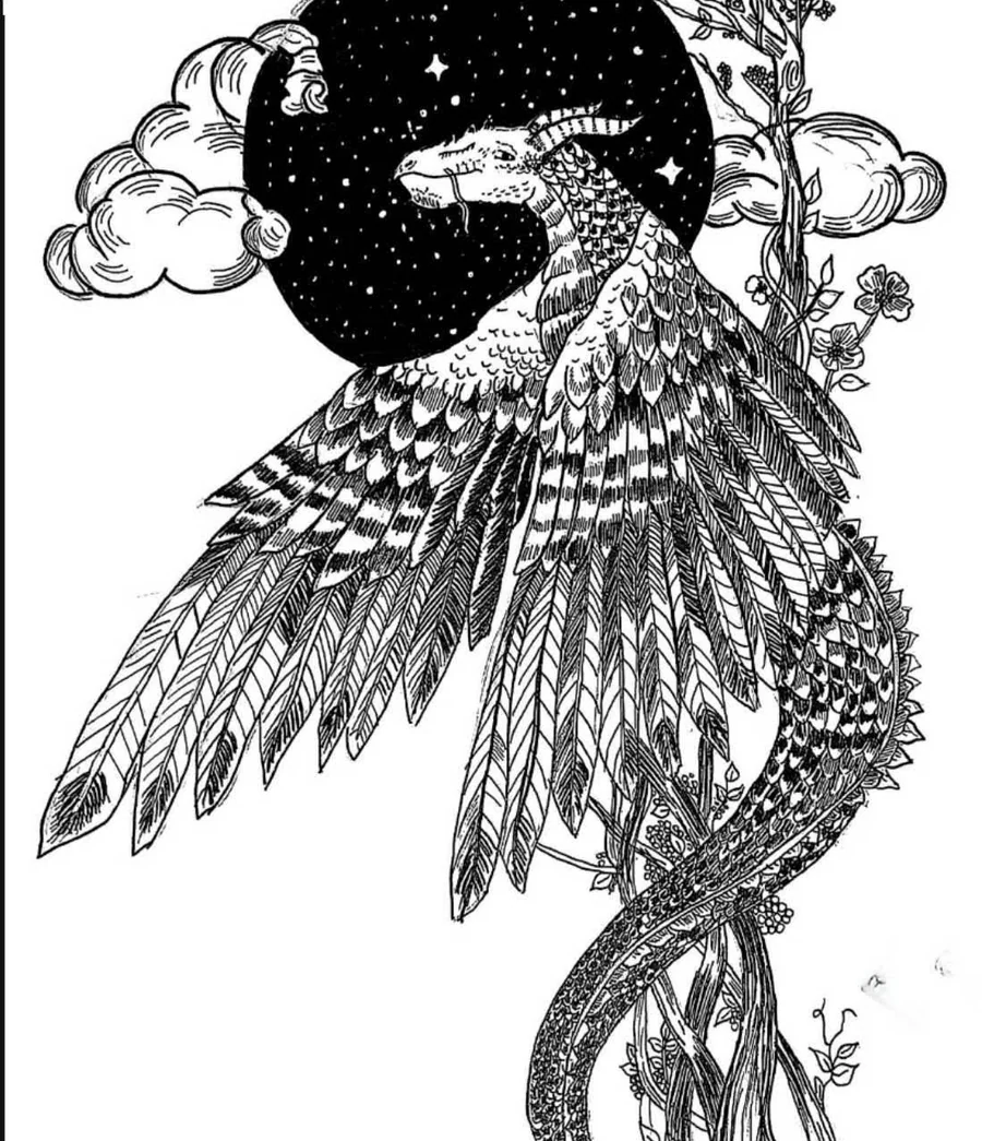
Ink illustration of a mythical bird-dragon in flight before a starry moon, surrounded by branches and blossom.
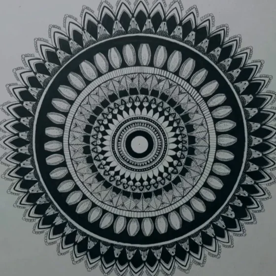
Hand-drawn mandala built from concentric rings of petals and geometric line work.
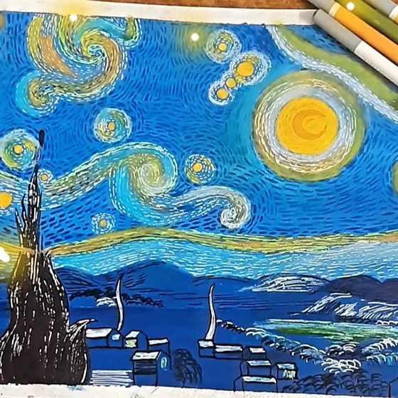
Coloured-pencil study after a swirling starry night sky over a lakeside town.
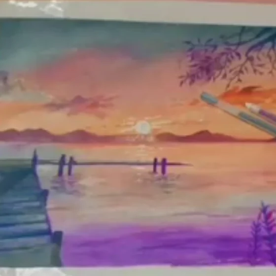
Watercolour study of a wooden dock at sunset, in orange and violet tones.
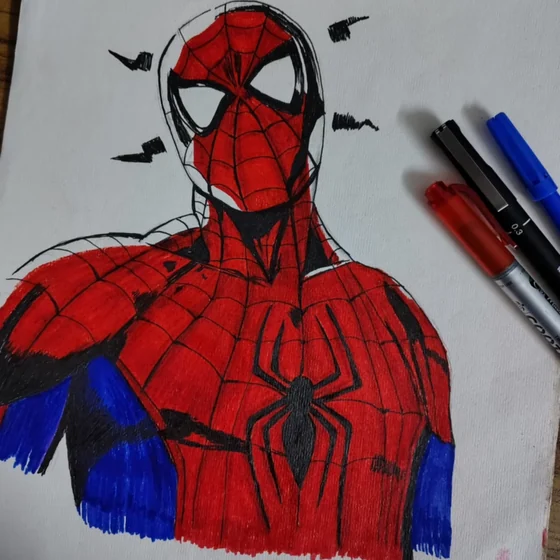
Marker character study, inked and coloured in red and blue.
Education
BSc Computer Science and Information Technology
St. Xavier's College, Maitighar, Kathmandu
12/2023 – present · third year of four
Certificates
  • Foundations of User Experience (UX) Design
  • Start the UX Design Process: Empathize, Define, and Ideate
  • Build Wireframes and Low-Fidelity Prototypes
Languages
English · Hindi · Nepali
Away from the screen
Painting · sketching · video editing
Based in
Kathmandu, Nepal